Color has a strong influence on customer psychology, yet some eCommerce store owners are unaware of it. The study of colors in relation to human behavior is known as "color psychology." The purpose of color psychology for Shopify stores and in any eCommerce business is to persuade people to choose something specific.
Color psychology for Shopify stores is important because proper color can distinguish your product from the other brands in the online crowd. According to Review 42,
colors themselves might impact up to 90% of a person's first impression. If you are concerned about the color psychology of Shopify and want to know how color attracts customers for your eCommerce business, then do focus on the visual appearance of your store.
In this article, we will discuss the color psychology for your Shopify stores with the perception of eCommerce marketing and branding.
According to Various Statistics: How Does Color Psychology Work For Shopify Stores?
About color psychology, there are lots of statistics. For instance, according to
WebFx:
- 84.7 % of people consider color as a primary reason to buy a particular product
- 93% of people look at visual appearance
- 6% of customer looks at the texture
- 1% of people observe sound or smell
According to the color study, customers judge individuals, their surroundings, and the product's appearance in between the first two minutes of observation.
So, as a Shopify owner, if you are not already concerned about color psychology, conduct some research on your customers' color preferences. We've included some in-depth studies on various colors and their influences on customer psychology.
Different Colors and Color Psychology for Shopify Stores
Before learning about the different colors, you need to focus on color theory and the color wheel. The color theory provides a framework of the fundamental rules and criteria that defines the color and its use in the construction of visually appealing representations.
On the other hand, a color wheel is a tool for designing harmonious color schemes because it organizes all colors in the spectrum according to their connections. Red, yellow, and blue are the main colors of the wheel, and they are combined to make secondary colors such as orange, green, and violet.
Before fixing the colors in your Shopify store, understand the difference between hues, tints, shades, and tones. We see a few common colors in our everyday life. Our eyes consider tints, shades, and tones very eye-soothing.
When you apply a tint, shade, or tone, the actual color does not change; it becomes lighter, darker, or less bright. As a result, the location of the color on the color wheel is unchanged by this process. Here are a few best colors that are perfect for your Shopify Store:
- Brown
- Yellow
- Orange
- Green
- Pink
- Red
- White
- Purple
- Blue
- Gray
- Black
#1 Brown
Brown is a solid and stable color that looks highly comforting to customers. It boosts confidence and, when utilized correctly, helps convert a visitor into a potential consumer. The Shopify Theme Store has a few brown-colored customizable themes.
Moreover, the brown color utilized in eCommerce design shows warmth and comfort. It is commonly used in outdoor activities, camping, and craft sales.
#2 Yellow
Yellow is a bright and fun color that will attract customers' attention. However, too much yellow can disturb clients. So, keep it within a limit.
The yellow color theme goes well with food and any cheerful brand such as household or automotive. But, if you are selling clothes or any finance-related store, avoid using yellow in your theme shop.
#3 Orange
Orange is a vibrant color that expresses desire and strength. It also symbolizes energy, innovation, and new beginnings. When orange is combined with cool blue tones, it may create a pleasant and lively atmosphere.
To increase the CTA and sales of your store, use the orange color. This color scheme is popular in healthcare and technology-related stores. Avoid using orange for your clothing store barn. It implies a lack of serious academic ideals as well as poor taste.
#4 Green
Green is a natural color that defines the growth of natural harmony. Shopping green is generally associated with shoppers' happiness, relaxation, safety, and harmony. Green is best for food, agriculture, households, technology, and finance.
#5 Pink
Pink is often linked with femininity, but it may appeal to men since it communicates kindness, passion, and love. Because pink is calming, it may be utilized to balance out more aggressive colors like black, orange, and red.
Traditional buyers prefer pink. It is eye-soothing and similarly energizing, passionate, and powerful. It all depends on how it is used and mixed with other colors.
#6 Red
Red color reflects boldness and excitement. When used correctly, it has the potential to convert potential buyers into long-term customers. But, a website with too much red might be visually confusing to the customer.
Furthermore, red increases the heart rate and creates urgency. There are many popular drinks and food brands that use the color red for their branding. You can also customize your product and store theme with red.
#7 White
Most online pages choose white to express freshness, positiveness, and simplicity. A white theme grabs the attention of the bulk of customers if you are running a clothing store on Shopify. The color white has great color psychology towards Shopify customers.
#8 Purple
Purple has long been linked with royalty, power, and wealth. The strategic usage of this color will help a buyer make a good buying decision. Purple reflects an anti-aging gesture and is best for beauty product brands.
#9 Blue
Trust, calm, and productivity are all conveyed by the color blue. Although blue is one of the most popular online colors, it should be avoided if your website is related to the hospitality business, particularly restaurants, because blue is thought to suppress appetite. Blue is popular in health care, finance, and technology.
#10 Gray
Gray is typically associated with seriousness and moderation. Gray in the correct tones may work well as a backdrop for more brilliant colors like orange, crimson, and royal blue.
#11 Black
Black is the most popular color in eCommerce. Black is connected with dominance, strength, and power. When utilized in eCommerce, it provides strong messages to customers. But overuse can create a gloomy and depressing atmosphere, so it should be used lightly in connection with other soothing colors.
Color Psychology Differences: Female vs Male
Colors are classified into two types: warm and cold. Two categories of color influence shade: tones and tint. Warm colors are those that fall into the red shade of the color spectrum. Red, orange, and yellow express warmth, feelings, and passion.
Warm colors have long wavelengths and release a great deal of energy. As a consequence, warm colors look best when they are blended with two colors. Using warm colors as a primary color can easily make your store design attractive.
On the other hand, cool colors mainly contain blue shades, tones, and tints. Cool colors include purple and green also. These colors have a natural calming effect, and frequent usage of these colors in home design inspires relaxation. But, excessive usage of cold colors reflects grief and sorrow.
Including warm and cold color psychology for Shopify stores, different genders have different choices of color. Here is the ratio of females to males:
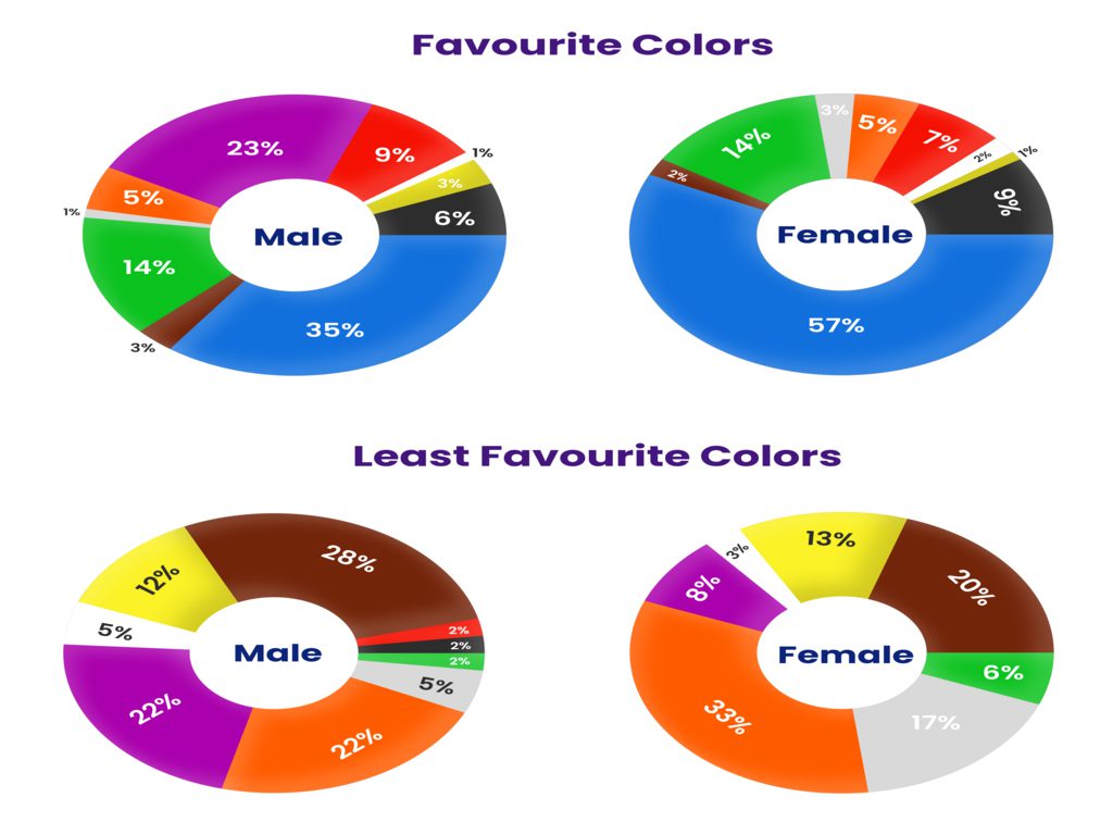
Though the color selection is influenced by culture and personal preference. This problem can be found not only in shop themes; it can be found whenever you sell a particular color product.
So, to cut the hassle, use a
product customization application so that your customers can design their products by themselves. According to the
daily egg,
color is the major reason for purchase for 85% of shoppers. Furthermore, 66% of individuals will not purchase a product unless it is available in the color of their choice.
Bottom Line
To conclude, the Color Psychology for Shopify stores as well as in any eCommerce Business depends on customer gender, culture, and businessman choice. But to ignore the confusion, use the colors that we have mentioned. Your product pages, call-to-action-buttons, page themes, and homepages influence the audience's perceptions. Every color has its own set of characteristics, and color psychology seeks to determine which one will have the most impact on eCommerce.


