Last Updated on March 22, 2025 by Rakibul Islam
If you are an eCommerce store owner, every part of your website, including a product page, is essential. The home page, landing page, and blog sections all are crucial, but you must recognize the importance of a product page as well.
A visitor may see a homepage first, but product pages are valuable because they push customers into direct sales. So there is no way to ignore the need to optimize Product Pages. SEO can optimize the process by applying marketing strategy and image optimization.
According to studies, it only takes about 2.6 seconds to grab viewers’ attention which encourages them to stay on the product page to take the next step.
Researchers at Stanford University discovered that consumers respond more favorably to visual signals than content when deciding whether or not to make a purchase. In 2018, the average conversion rate for online businesses was only 2.86%. This figure can be improved by focusing on graphic components that raise conversion rates.
In this article, we will focus on how to optimize product pages to generate higher conversion. Firstly we will discuss the features of a product and a brief discussion about the conversion rate.
What Features Should an eCommerce Product Page Have?
An eCommerce store’s product page is where buyers may learn more about the item they’re interested in purchasing. All the details regarding the good they wish to purchase can be found here. Therefore, this is the essential feature of the virtual shop.
Website optimization requires using appropriate keywords and phrases throughout the site’s content. The same thing can be applied to a product page as well to optimize Product Pages effectively.
An ideal product page can include extensive product details, visual impact, and a product title. Even an SEO-optimized product page helps to boost website visibility. You can use keywords in the URL, page title, product description, and image captions/alt-texts of a product page.
An optimized product page for an online store boosts conversion rates and decreases cart abandonment. A product page should be organized in such a way that encourages customers to visit the store, add the product to their shopping carts, and then successfully let them complete the purchase process.
An eCommerce store owner must focus on the product page. Otherwise, the bounce rate will go down. That means people will enter and then leave your site instantly.
Great product pages can keep their bounce rate constant because they keep visitors engaged, make them interested in exploring the rest of the site, and ultimately gather a good conversion rate.
What is the eCommerce Conversion Rate?
The conversion rate in eCommerce is such a big topic that you cannot summarize it. The goal of conversion rate optimization (CRO) is to increase the sales of a particular business. A conversion rate usually keeps track of the number of customers or users who complete their desired action in a store.
Landing pages, category pages, product pages, and any other option of contact with the customer are related to improving the conversion rate. If someone’s store has 2000 visitors and he gets 50 conversions, then his conversion rate is 2%.
Ways to Optimize Product Pages to generate Higher Conversion: 7 best ways
- Make people interested in your product
- Try to meet customer’s concern
- Input a practical CTA button
- Add high-quality video and GIFs to the website
- Showcase client review
- Promote upsell and cross-sell
- Use third-party application
Way 1: Make People Interested In Your Product
What does your eCommerce company stand for? Keeping customers happy and providing them with whatever they want should be the main motto of a business. Make customers your primary concern. First of all, find out what they want.
For instance, when you will just want to run an online store, you will find many options and products to start on. But do not jump into something without any planning. Know your business model and what your targeted customers want. Of course, a B2B buyer won’t act like a B2C buyer.
Ornament your store so that when your customer visits any product page, it grabs their attention. To optimize Product Pages effectively, consider how the design and layout influence your customer’s experience.
First of all, you can add a clear image of your product. To improve the site’s usability and user experience, high-quality images have a significant impact. But before adding any photos, just keep in mind the resolution.
Use a photo that does not take forever to load. We know that a slow-loading website or page (more than 3 seconds) harms traffic.
According to research conducted by Unbounce in 2019, approximately 70% of customers said page speed affects their decision to buy from an online store. Also, 50% of the respondents said they would skip product pages that take too long to load images and videos.
Secondly, write appropriate product descriptions for your product. Informative product descriptions always leave a good impression on a business. Proper product descriptions lure their audience, convey value, and convert casual browsers into committed buyers. To optimize Product Pages effectively, ensure your product descriptions are accurate and incorporate relevant keywords for better search engine rankings.
Retail data shows that 40% of customers who buy something online return it because the product description needs to be more accurate.
Way 2: Try To Meet the Customer’s Concern
Your product page is now optimized with pictures and descriptions, but have you met the customer concern?
For example, let’s say you use Shopify to run a business and sell different variants of products in your store. When customers go to your product page, they have to go back and forth to choose a product from the other variants, which is time-consuming. You should remember that every eCommerce customer is busy, especially if you are trying to sell to B2B wholesale merchants.
So, if your customers are facing problems, you must find a way to help them as a store owner. As a solution, you can use a one-click add-to-cart application for Shopify to make ordering a product with multiple variants easier.
You can also poll or research online to find out what problems customers have and plan a good solution. Because your customer will only like it if a product page is apparent when trying to buy something.
Way 3: Input a Practical CTA Button
On a product page, “call to action” (CTA) refers to an image, a button, or even just a line of text that encourages the customer to take action.
Calls to action (CTAs) are a great way to influence conversion rates and lead visitors through the sales funnel. You will be surprised that 70% of small B2B businesses count losses because of not adding a CTA button.
There is no doubt that a compelling call to action (CTA) gets people’s attention and guides them skillfully to the signup form.
While crafting a CTA button on a product page, do not follow a random design because a CTA button should relate to the product page. To optimize Product Pages effectively, ensure that your CTA is relevant to the page’s content. You can use any combination of elements that you like, including fonts, text, and brand colors. However, A call to action must be readily noticeable. Remember that a compelling call to action needs a high point of visual contrast.
Way 4: Add High-Quality Video And GIFs To The Product Page
Adding images, videos, and GIFs makes a product page attractive. Not only that but relevant videos and GIFs make products suitable and help customers understand the mechanism of the effect.
Suppose you do not sell any visual products; instead, you sell services or applications for an eCommerce store, as Shopify allows using third-party applications in stores. In this case, a tutorial video, an instruction video, or an introduction to the app’s features can be helpful to the customer.
Additionally, to optimize Product Pages effectively, high-quality videos and GIFs reduce the need for extra communication between clients and representatives.
Way 5: Showcase Client Review
When a prospect or a new client just visits your product page, he must love to see some positive reviews from existing clients. Customer feedback is essential to gathering customer trust. When you say your brand creates excellent products or services, new customers usually do not believe you.
They will prefer to see proof from other customers just like them that your business keeps its promise to meet their expectations.
Focusing positively On a product page is always good for showing your business potential. To optimize Product Pages effectively, displaying genuine reviews can significantly enhance credibility. According to Bright Local, 97% of customers read reviews while buying a product, and 12% read it daily.
On the other hand, showing negative reviews with solutions is another practical idea to encourage customers. Because sharing some of the difficulties of existing customers will help prospects relate,
Way 6: Promote Upsell And Cross-Sell
To increase sales, businesses often use cross-selling strategies to get customers to buy related products. On the other hand, upselling is persuading consumers to buy a different product or service that is more expensive than the one they just bought. According to the sales funnel strategist, in 2021, 60% of eCommerce business people applied to upsell and cross-sell strategies.
So, the company can only profit from upselling and cross-selling techniques. But which upsell and cross-sell products are best showcased on the product page?
As a suggestion, it is a good idea to suggest similar products to your customer on product pages that can generate more sales. To optimize Product Pages effectively, showing relevant related products can encourage customers to explore other options, potentially leading to additional purchases.Customers who come to buy something specific can also change their minds to buy something else to meet their needs.
For example – When we go to a super shop to buy something, most of the time, we buy something else as a part of emotional buying.
This product suggests the process also applies to companies that provide services rather than visual products. Now You can ask how?
A company that sells services or apps can give its customers the same features or a more extensive package by showing more benefits.
For example, InkyBay – product configurator for customizing products, has four different packages with many features. They gathered information about each package so people could easily compare its features and benefits. If you are one of those, who sell applications, you can use this method to promote upselling and cross-selling.
Similarly, as we know, convincing clients to buy a higher-tier package is a way of upselling, and offering to sell an additional service of an application is an example of cross-selling for an application development business.
If you still need clarification, You can read here to learn more about upselling and cross-selling.
Way 7: Use a Third-Party Application
Using a third-party app is a way to make the product page of an eCommerce store attractive. If you have Shopify or a similar platform that lets you use this third-party app in your store, it may be better to do so.
But remember that the application’s requirements will differ depending on the store, its business model, and what customers want.
For instance, if you want to do business with someone who owns an apparel store, you might need to use a product configurator with several customization options to allow your customers to design their own. You can see an example below.
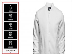
On the other hand, if you’re going to do business with B2B wholesalers, you might need to focus on quick order applications since they usually buy in bulk.
A product page with the right third-party app will always look perfect, well-organized, and easy to use. Choose an application that is easy to use and has a customer-focused support system. It should also be affordable and flexible.
Bottom Line
An informative product page is really important because it helps businesses sell more, save money, and make more money. When you optimize Product Pages, you make sure that your customers can find what they need quickly, order easily, and move through the shopping steps without any trouble. This means they don’t get frustrated, and it helps them buy more from your store! So, making sure your product page is clear, simple, and quick to use is the key to making everything run smoothly and growing your business.


